Eric Nitsche
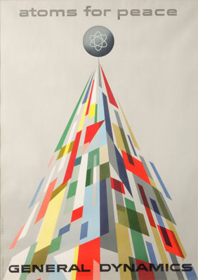
Title: Atoms par le Pace 10547
Nitsche was a pioneer in the design of books, annual reports, and other printed material that relied on meticulous attention to the details of page composition, the elegance of simple type presentation, and the juxtaposition of elements on a page. His hallmarks were impeccably clear design, brilliant colors, smart typography, and an adherence to particular geometric foundations. Nitsche is best known for his historic relationship with the engineering company General Dynamics. He designed a breakthrough series of posters, in addition to designing their corporate image, annual reports, and advertising. He was hired as art director for General Dynamics and savored designing technical data for such things as hydraulic systems and cross-sections of airplanes.
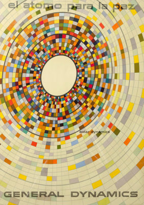
Title: El Atomo Para la Paz
A Swiss-born artist, Erik Nitsche bucked the popular Art Deco design trend of the 1920’s in favor of the more orderly, rational Bauhaus style. He moved to America in the early 1930’s to avoid the impending war in Europe. The Bauhaus style attracted attention in New York, and after a stint with fashion and decorative magazine spreads, he moved on to become the art director of Air Technology and Air News magazines. This technical topic suited him, and he worked with a large number of clients. Ever restless, Nitsche moved on again to work with General Dynamics Corporation. GDC was founded in 1899 and is an multinational aerospace and defense corporation. At the time of Nitsche’s work with them, they were working on developing submarine technology. General Dynamics hired Nitsche as art director in 1955 with the hopes that he could use his design skills to convey the message that atomic energy and the company were purveyors of peace instead of destruction. Nitsche was given total freedom to rebrand the company. Between 1955-1960 Nitsche built a total corporate identity for GDC. Poetic interpretations of atomic energy and their products were printed onto posters, postcards, brochures and even a 420-page book that detailed the history of the company. This particular piece is from the General Dynamic “Atoms for Peace” series printed in 1956.
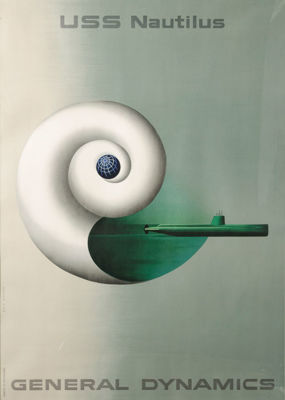
Title: Nautilus 10548
This advertising poster for General Dynamics is part of Nitsche’s series from 1955 celebrating “Atoms for Peace”. This particular poster depicts the first atomic powered submarine coming out of a Nautilus shell. portraying it as a part of a natural technological progression. This series is very much a product of the Cold War. Each poster represents a peaceful use of the atom in response to the public’s fear of this dangerous new technology. The style is intended to reinforce a vision of a clean, peaceful, technocratic, atomic future that never quite arrived.


